Selecting an option from a dropdown sounds simple until your application needs to handle hundreds of records, users, countries, timezones, or categories.
Traditional select components work well for small lists, but they quickly become difficult to use as your data grows. Users end up scrolling through endless options, slowing down workflows and creating unnecessary friction.
That's where a combobox becomes a better choice.
A combobox combines a searchable input field with a dropdown menu, allowing users to find and select options faster. Instead of manually browsing a long list, users can simply type a few characters and instantly narrow down the results.
For React and Next.js developers, Shadcn UI provides a flexible foundation for building modern combobox experiences. Since the components are fully customizable, you can adapt them to match your application's design system while maintaining accessibility, keyboard navigation, and excellent user experience.
In this collection, you'll find some of the Best Shadcn Combobox components for modern web applications, including:
Searchable dropdowns
Country selectors with flags
User selection comboboxes
Multi-select checkbox comboboxes
Timezone pickers
Virtualized comboboxes for large datasets
Linear-inspired combobox patterns
Advanced filtering interfaces
Whether you're building a SaaS dashboard, admin panel, internal tool, onboarding flow, or customer-facing application, these Shadcn Combobox examples can help you create faster and more intuitive selection experiences.
Let's explore the best Shadcn Combobox components you can use in your next React or Next.js project.
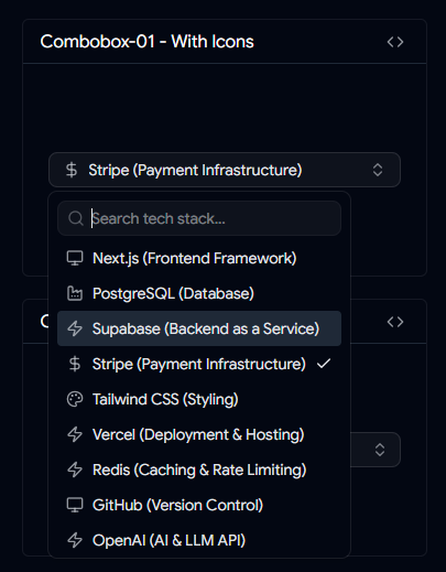
Combobox with Icons
A searchable combobox that combines text labels with visual icons, helping users identify options faster without reading every item.
Icons improve recognition and make selections more intuitive, especially when working with tools, technologies, categories, or branded options.
Best For
Technology stack selection
Feature categorization
Product management dashboards
Tool and platform selectors
Key Features
Icon support inside dropdown items
Faster visual recognition
Searchable option list
Customizable item rendering
Accessible keyboard navigation
👉 Live Preview
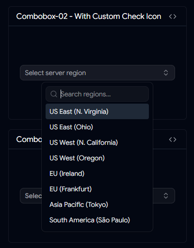
Custom Country Check Icon Combobox
A country picker designed with custom selection indicators that provide clearer visual feedback than standard checkmarks.
This pattern helps users quickly confirm their selection while maintaining a clean and polished interface.
Best For
Key Features
Custom selected-state icon
Searchable country list
Clear visual confirmation
Mobile-friendly interaction
Tailwind CSS customization support
👉 Live Preview
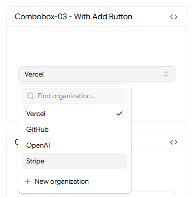
This combobox combines option selection with item creation, allowing users to add new entries directly from the dropdown interface.
Instead of forcing users to leave the form, they can create and select items in a single workflow.
Best For
Key Features
👉 Live Preview
Timezone Combobox
Selecting a timezone can be challenging when hundreds of options are available. This combobox simplifies the experience with searchable timezone data and organized results.
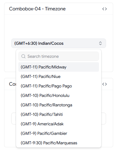
It's an essential component for scheduling systems, booking platforms, and globally distributed applications.
Best For
SaaS applications
Scheduling platforms
Meeting management tools
Remote team software
Key Features
Searchable timezone database
Fast filtering
Global timezone coverage
User-friendly selection experience
Optimized for large option sets
👉 Live Preview
User Selection Combobox
A user-focused combobox that displays avatars, names, and selection indicators to make team management workflows more intuitive.
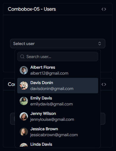
This pattern is commonly used in dashboards where users need to assign tasks, projects, permissions, or responsibilities.
Best For
Key Features
👉 Live Preview
Country Combobox with Flags
A country selector enhanced with flag icons to improve recognition and reduce selection errors.
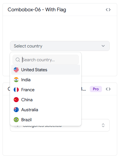
Visual cues help users identify countries faster compared to text-only dropdowns.
Best For
Key Features
👉 Live Preview
Virtualized Shadcn Combobox
Built for performance, this combobox uses virtualization to efficiently render thousands of options without slowing down the interface.
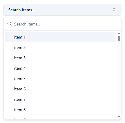
Only visible items are rendered, making it ideal for large datasets and enterprise applications.
Best For
Enterprise dashboards
Large databases
Analytics platforms
Internal business tools
Key Features
👉 Live Preview
Downshift Selection Combobox
A multi-select combobox powered by Downshift that provides advanced keyboard interactions and flexible selection patterns.
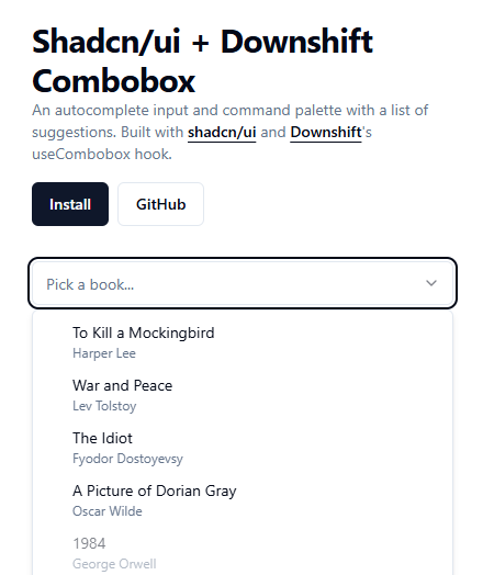
Users can select multiple items using checkbox-based interactions while maintaining accessibility standards.
Best For
Reporting filters
Search refinement panels
Settings pages
Data exploration tools
Key Features
Checkbox multi-selection
Accessible keyboard controls
Advanced filtering support
Flexible customization
Supports complex selection workflows
👉 Live Preview
Shadcn Linear Combobox
Inspired by Linear's clean interface design, this combobox focuses on speed, clarity, and minimal visual distractions.
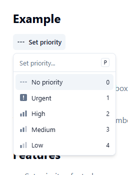
The result is a streamlined selection experience that feels modern and highly responsive.
Best For
Task management apps
Productivity tools
Issue tracking systems
Modern SaaS dashboards
Key Features
Linear-inspired UI
Minimal visual design
Fast interaction patterns
Priority and status selection
Optimized user experience
👉 Live Preview
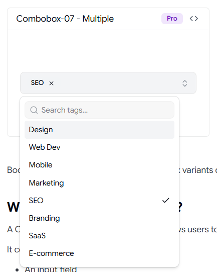
Multiple Selection Checkbox
Selecting multiple options should feel fast, not overwhelming. This multiple selection checkbox combobox allows users to search, filter, and select several items from a single dropdown without cluttering the interface.
Unlike traditional multi-select fields, selected items remain easy to manage, making it ideal for admin dashboards, filters, permissions management, and team assignment workflows.
Best For
User role management
Product filters
Category assignment
Tag selection systems
Key Features
Multi-select checkbox interface
Search and filter support
Clear selected state indicators
Keyboard accessible navigation
Works well with large datasets
This pattern is commonly used in SaaS dashboards where users need to select multiple records without leaving the current screen.
👉 Live Preview
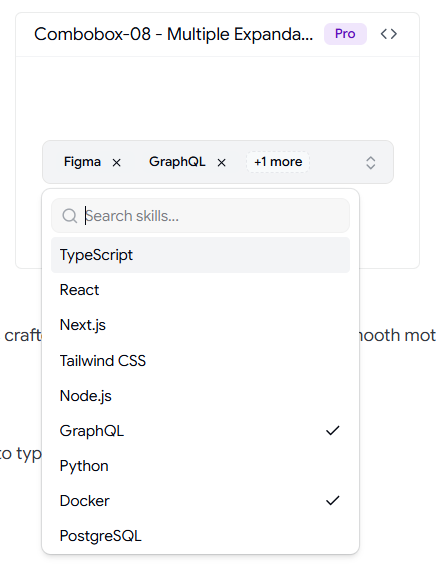
Multiple Expandable Checkbox
When options are grouped into categories, a standard combobox can become difficult to navigate. This expandable checkbox combobox organizes selections into collapsible sections, helping users find what they need faster.
It's particularly useful for settings pages, advanced filters, and permission management systems where options naturally belong to different groups.
Best For
Key Features
Expandable option groups
Nested checkbox selection
Better organization for large option sets
Improved discoverability
Mobile-friendly interaction
For applications with dozens or hundreds of selectable options, grouped expansion provides a cleaner and more scalable experience.
👉 Live Preview
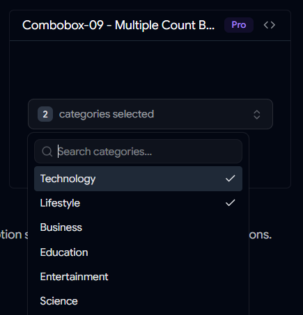
Multiple Count Badge Combobox
This combobox improves multi-selection UX by displaying selected item counts directly inside the trigger. Instead of showing long lists of selected values, users immediately understand how many items have been chosen.
The count badge pattern keeps forms compact while maintaining clear feedback during the selection process.
Best For
Key Features
Dynamic selection count badge
Compact trigger design
Supports large multi-select lists
Clear visual feedback
Optimized for dashboard interfaces
This approach is especially useful when users frequently select multiple items and need a clean interface that scales gracefully.
👉 Live Preview
Final Thoughts
A well-designed combobox can significantly improve how users interact with your application. Instead of forcing users to scroll through long lists, comboboxes make searching, filtering, and selecting options faster and more intuitive.
Whether you're building a SaaS dashboard, admin panel, onboarding flow, project management tool, or customer-facing application, choosing the right combobox pattern can enhance usability while keeping your interface clean and efficient.
From simple searchable dropdowns and country selectors to advanced multi-select, virtualized, and user assignment comboboxes, Shadcn UI provides the flexibility to create experiences that fit your exact requirements.
The examples featured in this collection demonstrate how a combobox can go beyond basic selection and become a powerful part of your application's workflow. With full Tailwind CSS customization, accessibility support, and seamless React and Next.js integration, these components are ready for production use.
If you're looking to build faster, more user-friendly forms and dashboards, these Shadcn Combobox components are an excellent place to start.
Looking for More Shadcn Combobox Components?
Explore this growing collection of Shadcn Combobox examples, templates, and reusable components designed for React, Next.js, SaaS applications, admin dashboards, and modern web projects.