A lot of developers get confused between collapsible & Accordion these two because visually they can look very similar. If you build dashboards or website with React, you’ve probably faced this problem.
A page starts simple, then more settings, filters, notes, and details get added. Before long, the interface feels crowded and harder to navigate.
That's where a collapsible component becomes useful.
Instead of showing everything at once, you can hide secondary content and let users expand it only when needed. The result is a cleaner interface without losing important information.
Good UI isn't about showing less content. It's about showing the right content at the right time.
Collapsible vs Accordion
Many developers use these terms interchangeably, but they're slightly different.
If you only need a simple expand/collapse interaction, a collapsible component is often the better choice.
A Few Tips from Real Web Projects
The component itself is simple, but small details can make it feel much better to use.
Here are a few things I usually keep in mind:
Use clear trigger labels like "Show More" or "View Details"
Add an icon so users know whether the section is expanded or collapsed
Keep animations fast and subtle
Don't hide information users need immediately
Avoid deeply nested collapsible sections
Keep the behavior consistent across your app
These small improvements make the UI feel more predictable and easier to navigate.
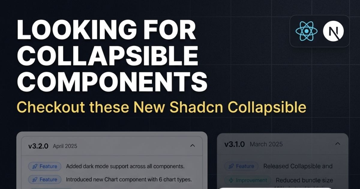
Popular Shadcn Collapsible Examples
These are some practical collapsible patterns that work well in React and Next.js applications.
RTL Collapsible
A collapsible component designed for Right-to-Left (RTL) languages such as Arabic, Hebrew, and Persian.
This variation follows RTL layout conventions, ensuring content, icons, and interactions feel natural for users reading from right to left.
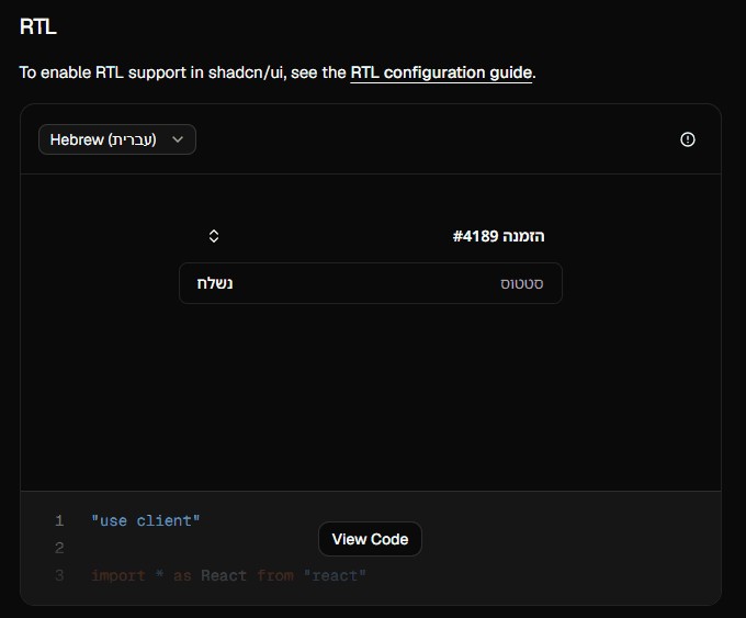
Features
- RTL language support
- Proper icon and content alignment
- Accessible keyboard navigation
- Works seamlessly with shadcn/ui RTL configuration
Best for: Arabic, Hebrew, Persian, and multilingual React or Next.js applications.
Dropdown Styled Collapsible
A button that reveals extra actions or options.
Useful for:
filters
quick actions
compact controls
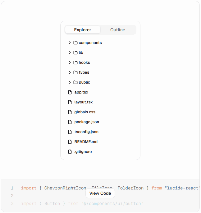
Folder Tree Collapsible
You can build simple explorer-like interfaces using nested collapsibles.
Great for:
CMS
admin tools
documentation viewers
Settings with Advanced Options Collapsible
Instead of overwhelming users with too many inputs, hide advanced settings.
Clean UI + better usability.
⬇️ Download the Code
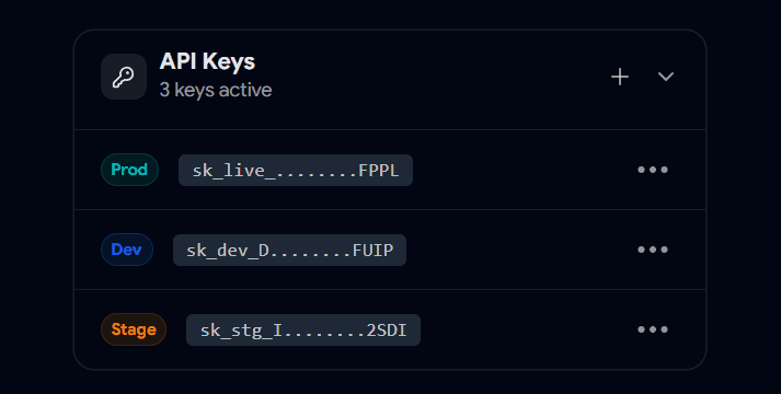
Secret Keys / Sensitive Data Collapsible
Perfect for things like:
Users can reveal only when needed.
Changelog / Updates Collapsible
Instead of showing all updates at once, let users expand specific versions.
Cleaner and easier to scan.
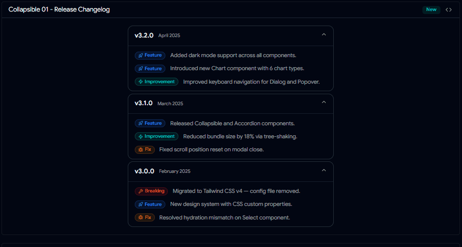
Very common in dashboards.
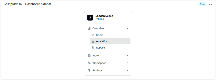
You keep the sidebar compact, but still support deeper navigation levels.
⬇️ Download the Code
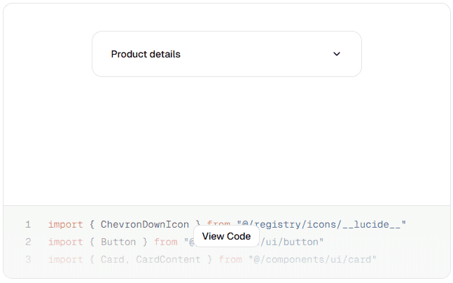
Collapsible Card
This collapsible component that lets users expand or collapse content with a click. Use the header icon to toggle visibility and keep your UI clean and organized.

⬇️ Download the Code
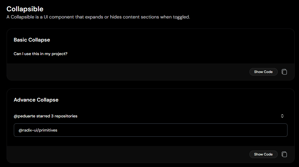
Basic Show / Hide Collapsible
The simplest use case.
Works well for:
FAQs
short descriptions
extra notes
Nested Collapsible (Grouped Content)
When you have structured data like:
categories
grouped settings
multi-level items
This pattern scales nicely.
⬇️ Download the Code
Where You'll Actually Use Collapsible Components
Once you start noticing them, you'll see collapsible sections everywhere.
They're commonly used in:
Any time you need to show extra information without overwhelming users, a collapsible component is usually a good fit.
Why I Use Collapsible So Often
In most real projects, not everything needs to be visible all the time.
Collapsible helps to:
Reduce visual clutter
Keep important content upfront
Let users explore details when they want
Avoid modals for small interactions
It’s a small component, but it solves a big UX problem.
Final Note
Collapsible isn’t a fancy component but it’s one of the most useful ones.
It helps you design interfaces that feel lighter without removing information.
If you’re building with shadcn/ui, this is something you’ll end up using again and again.
Want More Shadcn Collapsible Components ?
If you're building with shadcn/ui, try experimenting with different layouts and combinations.
You can reuse the same collapsible logic across many use cases.
Check out more modern Shadcn Collapsible components to use in your projects.
Built Collapsible components ?
If you’ve built any interesting collapsible patterns, I’d love to see how you’re using them in your projects.
Share it with me on:
I’d love to review it and feature it here.
Searching Shadcn Blocks, Components & Templates for Your Projects
Here are some useful resources from the Shadcn ecosystem: