Checkboxes are one of the most common UI components you'll use in React applications. They're used for forms, settings, task lists, filters, permissions, and many other places where users need to select one or more options.
Instead of building every checkbox from scratch, you can use Shadcn to create reusable and accessible components. Since it's built with React, Tailwind CSS, Base UI and Radix UI, it's easy to customize and works well in modern web projects.
In this collection, I've gathered different Shadcn Checkbox components that cover common use cases. From simple checkboxes and validation states to table selection, tree views, and avatar-based checkboxes, you'll find examples that you can easily adapt to your own application.
Why Use Shadcn Checkbox Components?
Shadcn Checkbox components are simple to customize and fit naturally into React and Next.js projects. They save development time while keeping your UI clean and consistent.
Some reasons developers like using them:
Built with React and Tailwind CSS
Based on accessible Base UI and Radix UI primitives
Easy to customize with Tailwind classes
Works with React Hook Form and Zod
Supports keyboard navigation
Responsive and lightweight
Ready for production projects
Whether you're building an admin dashboard, SaaS application, ecommerce website, or an internal tool, these checkbox components provide reusable patterns that you can use in real projects.
Let’s Explore Shadcn Checkbox Components
To help you save time, we’ve collected useful Shadcn Checkbox examples for React and Next.js. Each one is made for a different use case, so you can pick the right checkbox for your UI.
Default Checked Checkbox
This checkbox component comes selected by default when the page opens. It can help when you want to turn on a recommended option right away, like default settings or optional updates.
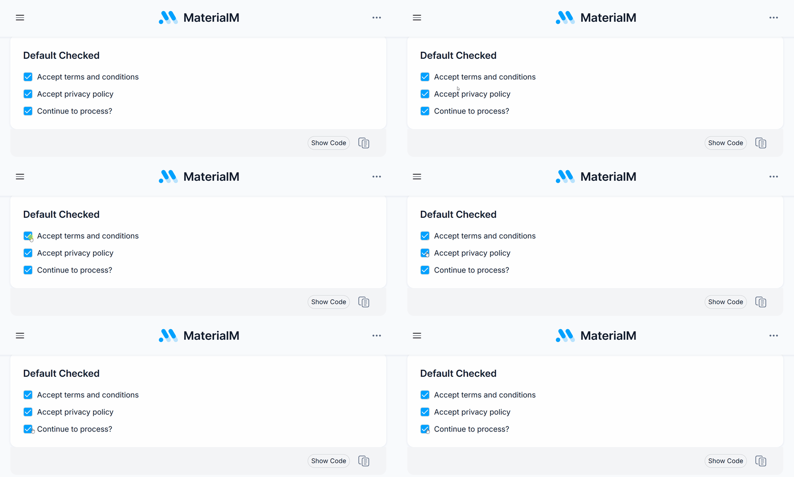
It can also reduce extra clicks while still letting users change the choice later.
- Selected by default
- Easy to manage with React state
- Works with forms and settings pages
- Supports keyboard use
- Easy to style with Tailwind CSS
Best For: Use this component for onboarding flows, default settings, subscription options, and forms where one choice is usually turned on.
Get Code
Disabled Checkbox
This checkbox component shows an option that users cannot click. It can help when a feature is not available yet, depends on another setting, or is blocked by permissions.
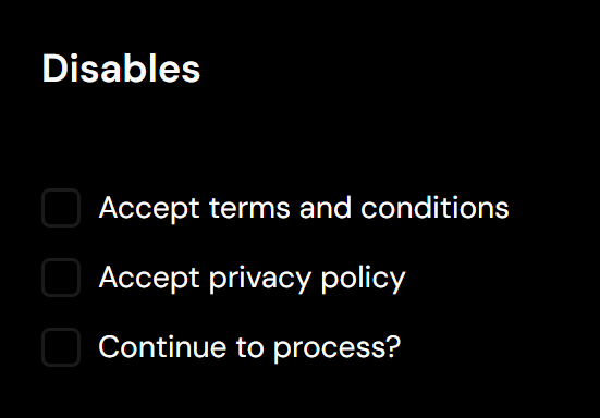
Instead of hiding the option, it shows users that the choice exists but is not ready to use.
- Prevents user interaction
- Shows unavailable options
- Supports disabled styling
- Works with permission-based screens
- Keeps layouts consistent
Best For: Use this component for admin dashboards, enterprise apps, permission screens, and forms with locked options.
Get Code
Invalid State Checkbox
This checkbox component shows an error when users must select an option before sending the form. It can help users see what is missing right away.
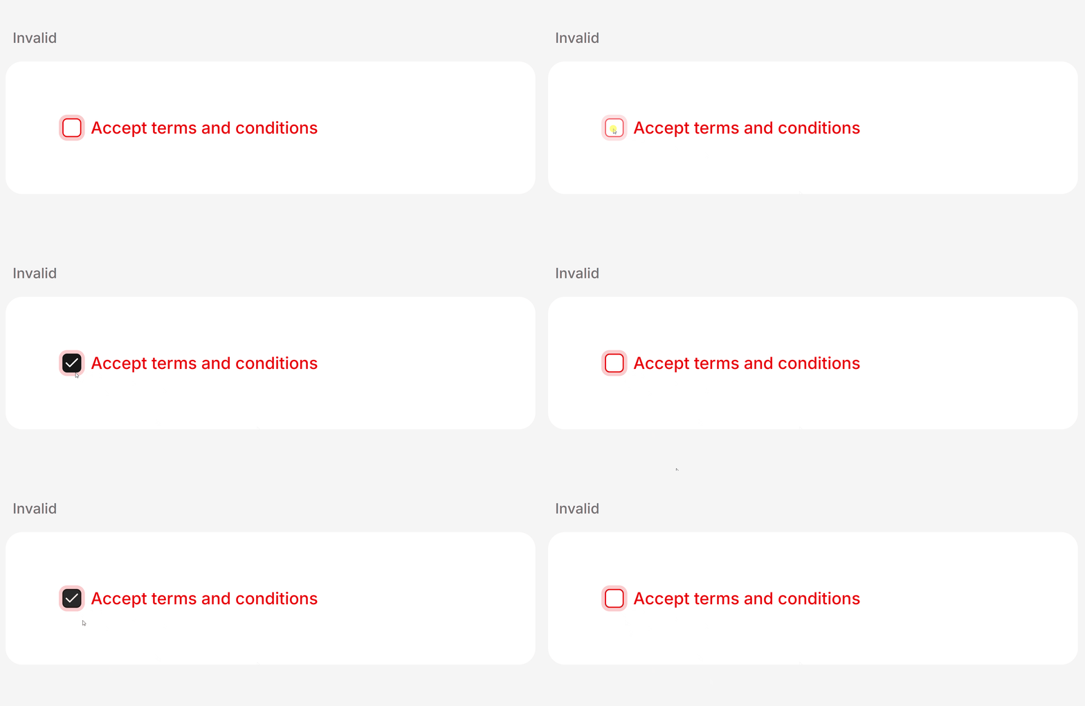
This is useful for terms of acceptance, privacy consent, or any required checkbox.
- Shows validation errors
- Makes forms easier to understand
- Easy to connect with form validation tools
- Supports custom error styling
- Gives clear form feedback
Best For: Use this component for forms with validation, login and signup pages, and compliance forms.
Get Code
Checkbox with Label
This checkbox component includes a clear label next to the box. It can help users understand what they are selecting and makes the checkbox easier to click.
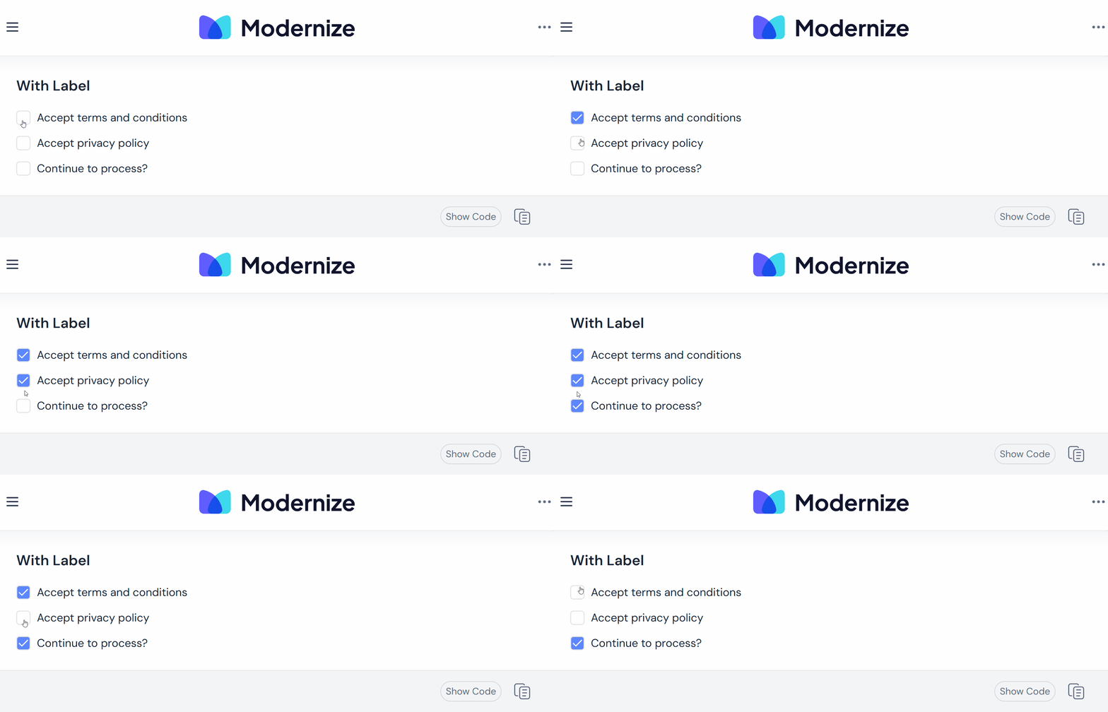
It is a good choice for consent, preferences, and simple form choices.
- Clickable labels improve usability
- Works well with screen readers
- Easy to customize
- Responsive layout
- Compatible with React forms
Best For: Use this component for login pages, signup forms, contact forms, newsletter signups, and consent forms.
Get Code
This checkbox component lets users choose more than one option. It can help when users need to pick interests, permissions, filters, or preferences.
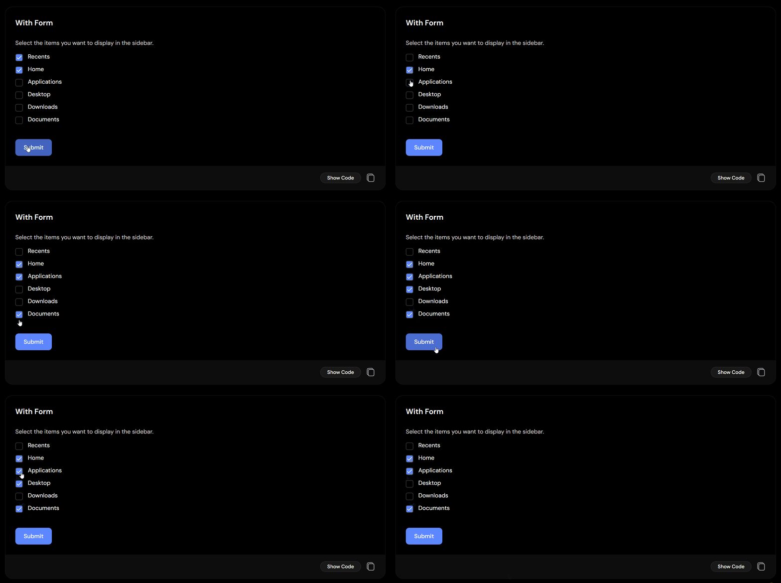
Each checkbox works on its own, so users can select many items without extra steps.
- Supports multiple selections
- Simple state handling
- Good for dynamic forms
- Easy to connect with APIs
- Responsive design
Best For: Use this component for surveys, product filters, preference forms, onboarding, and role selection.
Get Code
Checkbox with Multiple Sizes
This checkbox component comes in different sizes. It can help when you need small checkboxes for tight spaces or larger ones for mobile and touch screens.

Having size choices helps your UI stay balanced across different layouts.
- Small, medium, and large options
- Mobile-friendly sizing
- Easy Tailwind customization
- Works across different layouts
- Keeps the experience consistent
Best For: Use this component for responsive dashboards, mobile apps, data tables, and flexible layouts.
Get Code
Vertical Checkbox Group
This checkbox component shows options in a vertical list. It can help users read choices more easily and finish forms faster.
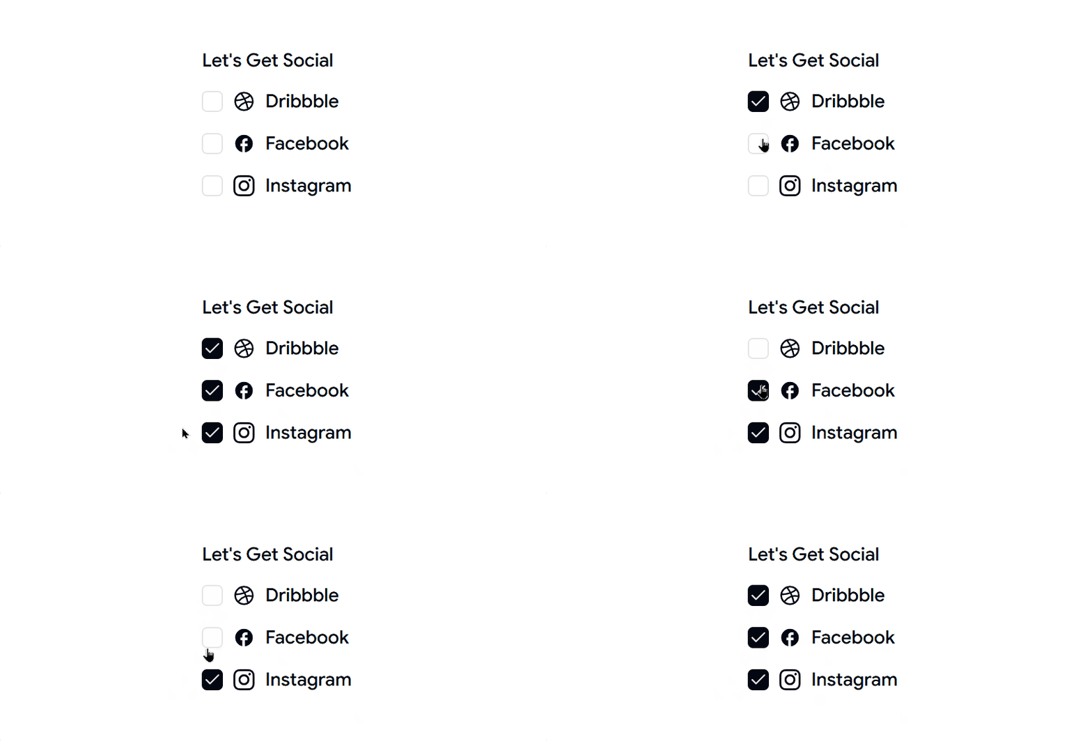
It works well for categories, preferences, and survey questions.
- Organized vertical layout
- Easy to scan
- Supports multiple selections
- Good spacing between items
- Responsive design
Best For: Use this component for surveys, account settings, onboarding questions, and preference pages.
Get Code
Color Variant Checkbox
This checkbox component uses different colors for different options. It can help users tell choices apart without changing how the checkbox works.
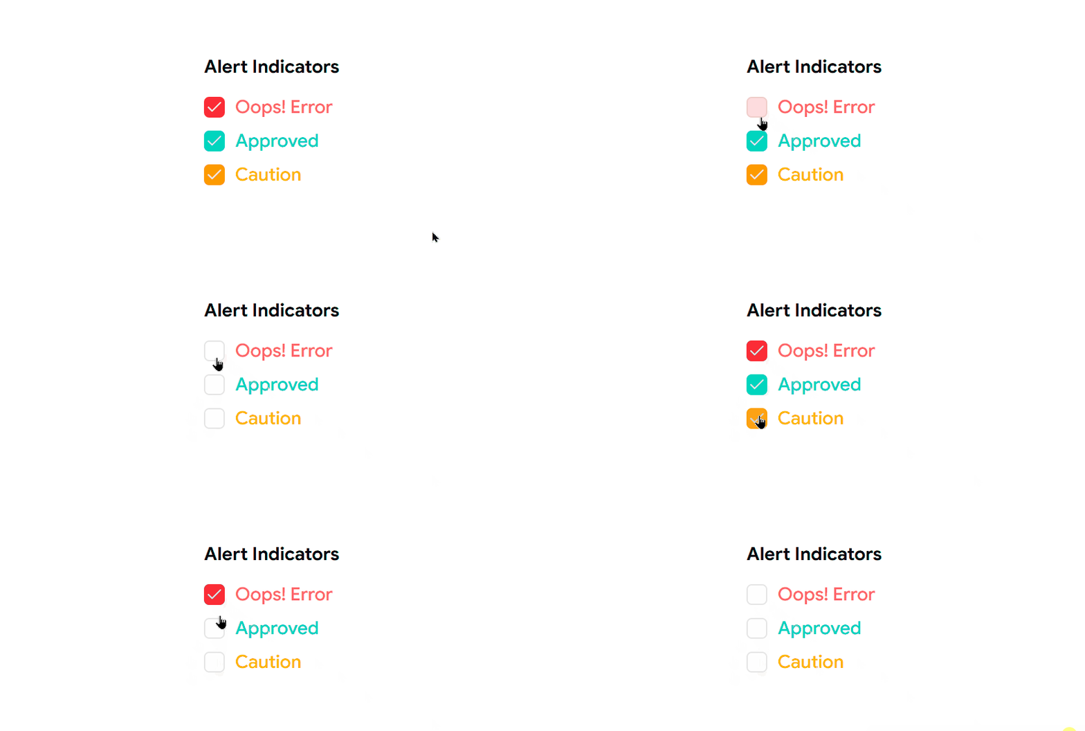
It is useful when you want to show categories, priorities, or statuses in a clearer way.
- Multiple color options
- Easy Tailwind customization
- Supports design systems
- Improves visual order
- Keeps the same checkbox behavior
Best For: Use this component for project tools, dashboards, productivity apps, and grouped selection screens.
Get Code
Todo List Checkbox
This checkbox component is made for task lists. It can help users mark tasks as done while keeping the list simple and easy to read.
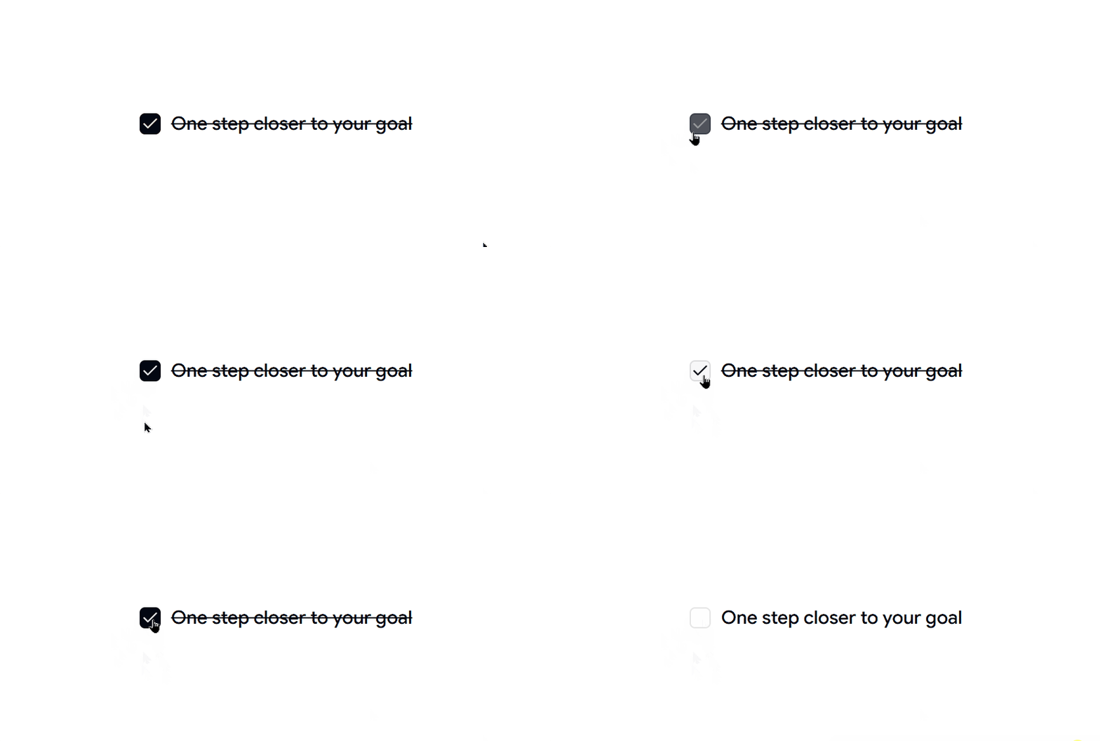
It gives quick feedback, which makes task apps feel more active.
- Shows task completion
- Easy React state handling
- Responsive layout
- Lightweight setup
- Good user experience
Best For: Use this component for todo apps, productivity tools, project planners, and personal task lists.
Get Code
Checkbox Group List
This checkbox component keeps related options together in one place. It can help users understand choices faster and avoid missing important items.
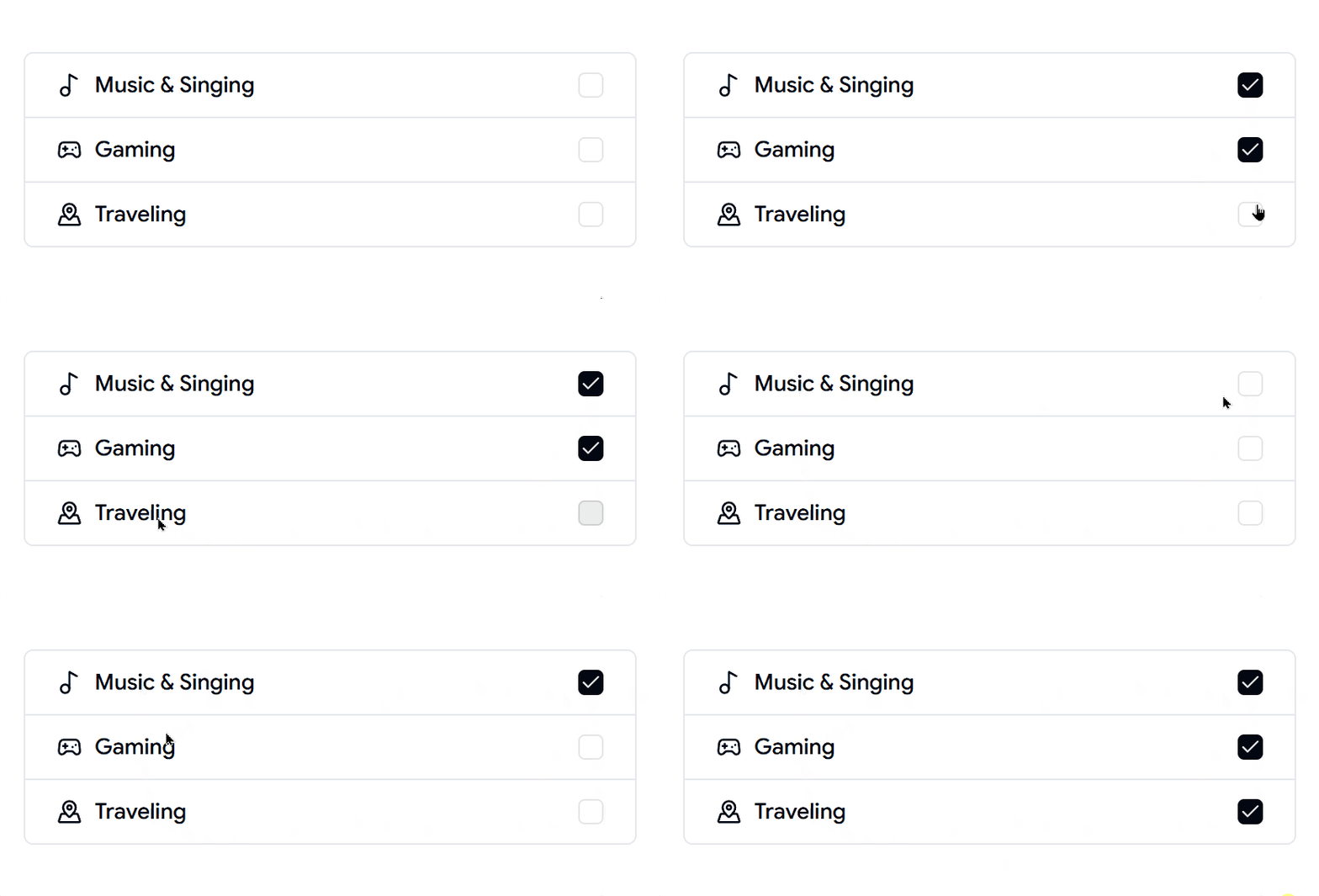
It is often used for permissions, features, and grouped settings.
- Keeps related options together
- Supports multiple selections
- Easy layout changes
- Works with dynamic data
- Clear and simple interaction
Best For: Use this component for settings pages, permission screens, configuration panels, and enterprise apps.
Get Code
This checkbox component is made for forms. It can help users accept terms, join newsletters, turn on notifications, or choose extra options.
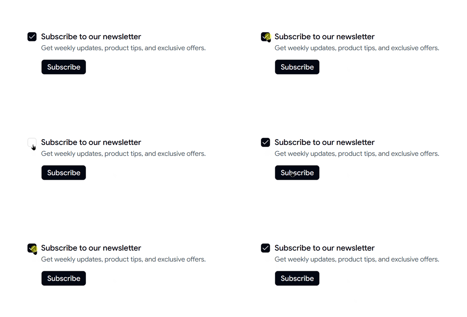
It also works well with form validation tools, which makes forms easier to build.
- Ready for form validation
- Works with React Hook Form
- Easy to use with a keyboard
- Simple to style
- Lightweight component
Best For: Use this component for signup forms, checkout pages, subscriptions, and onboarding flows.
Get Code
Checkbox with Custom Icons
This checkbox component uses custom icons instead of the usual check mark. It can help your UI feel more unique and match your brand better.
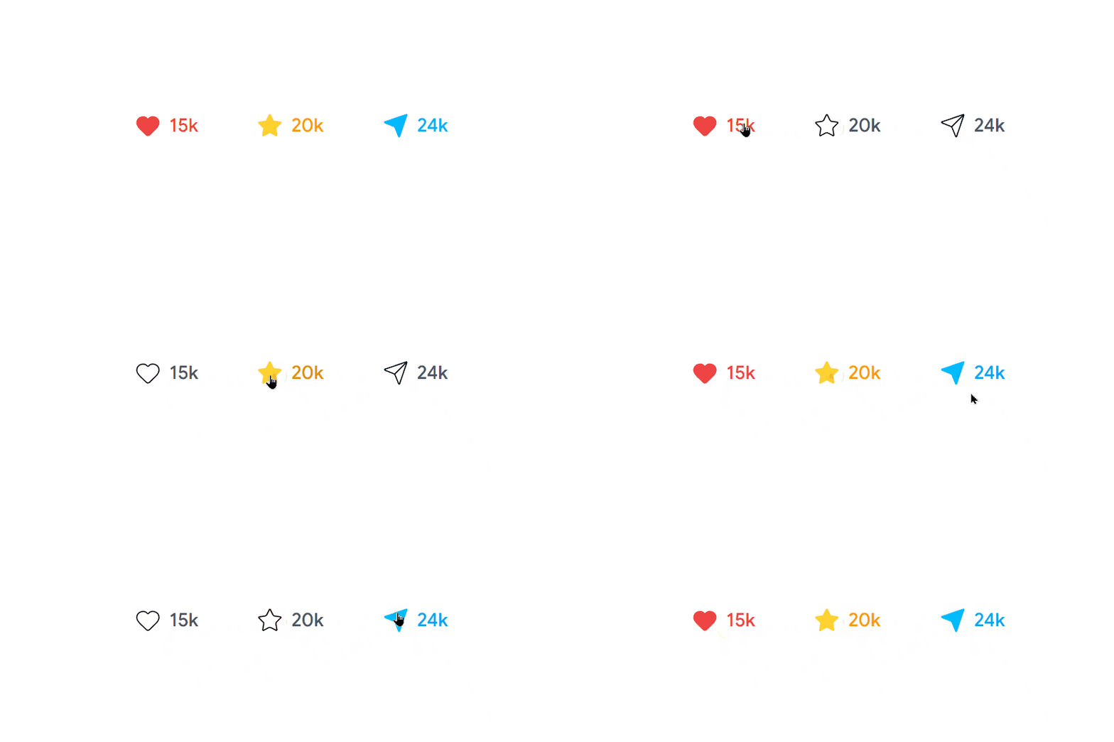
Custom icons can also show different meanings more clearly.
- Supports custom icons
- Easy to change
- Can include animation
- Flexible design options
- Keeps the same simple interaction
Best For: Use this component for branded apps, creative dashboards, custom design systems, and interactive interfaces.
Get Code
Dashed Border Checkbox
This checkbox component uses a dashed border for a more modern look. It can help highlight selectable items in creative layouts and dashboards.
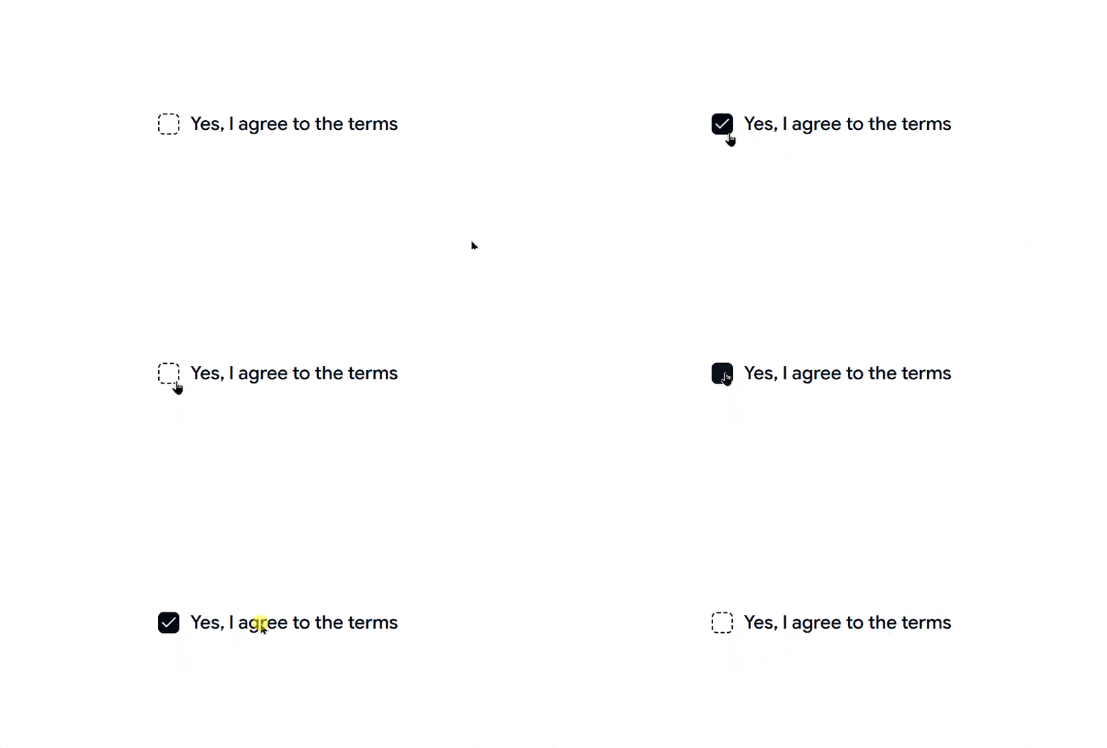
It keeps the same simple checkbox behavior while adding a different style.
- Modern border style
- Easy Tailwind customization
- Lightweight design
- Responsive layout
- Clear and simple interaction
Best For: Use this component for creative dashboards, portfolio sites, design systems, and modern SaaS apps.
Get Code
Tree View Checkbox
This checkbox component lets users choose items inside a nested list. It can help with folders, permissions, and categories where items have parent and child levels.
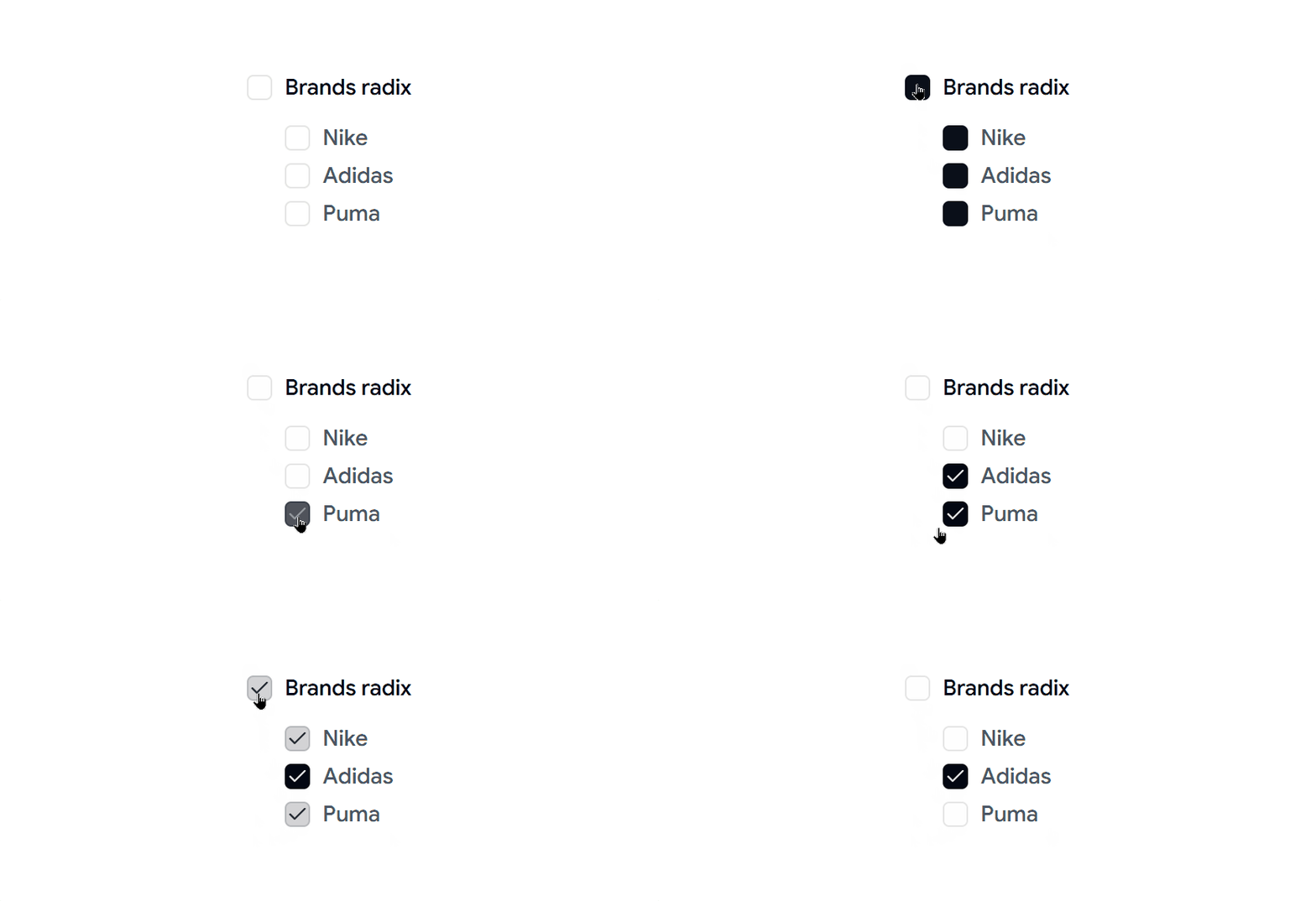
When users select a parent item, child items can also change depending on how you set it up.
- Supports nested lists
- Parent and child selection
- Great for permission management
- Works with dynamic data
- Easy to scale
Best For: Use this component for file managers, permission tools, category systems, and admin dashboards.
Get Code
Avatar Selection Checkbox
This checkbox component shows user avatars with the checkbox. It can help users pick team members, assign tasks, or manage groups more easily.
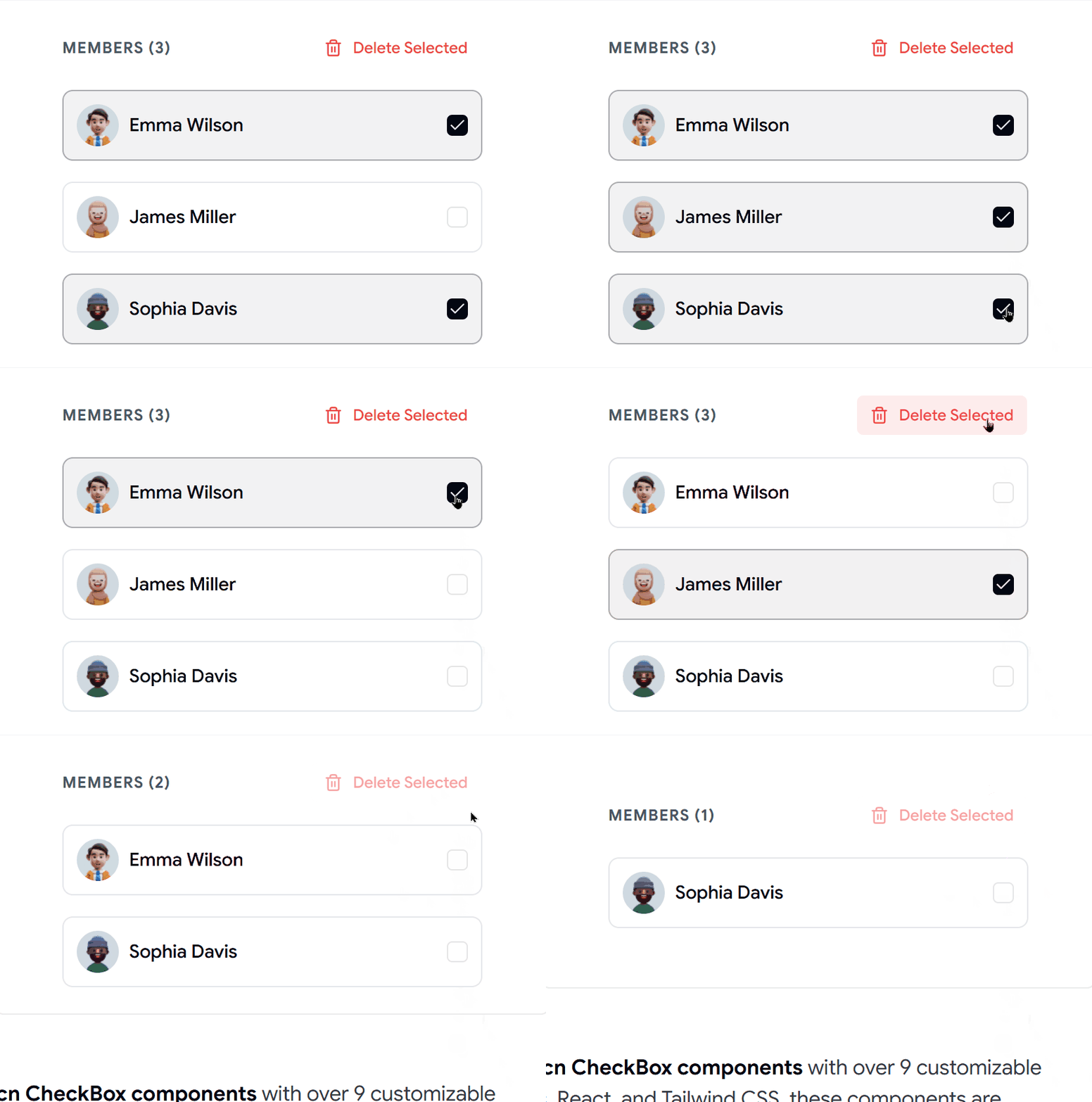
Seeing the profile image makes it faster to recognize people.
- Shows avatars with checkboxes
- Good for team member selection
- Responsive layouts
- Easy React setup
- Modern collaboration feel
Best For: Use this component for team tools, collaboration apps, task assignment screens, and communication platforms.
Get Code
Data Table Checkbox
This checkbox component lets users select rows in a table. It can help with bulk actions like delete, export, or update.
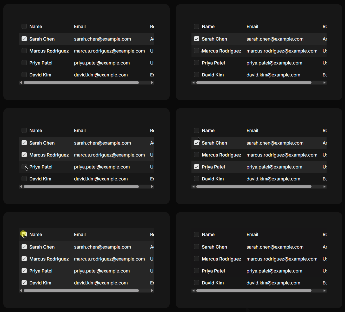
It is one of the most common checkbox patterns in admin dashboards.
- Row selection support
- Ready for bulk actions
- Header select-all option
- Works with paginated tables
- Good for dashboards
Best For: Use this component for admin panels, CRM tools, inventory apps, analytics dashboards, and large data tables.
Get Code
Final Thoughts
A well-designed checkbox does more than let users select an option. It helps create forms that are easier to understand, settings pages that are simpler to manage, and dashboards that feel more intuitive.
The Shadcn Checkbox components covered in this article give you ready-to-use solutions for many common UI patterns. Instead of spending time recreating the same components, you can customize these examples and focus on building the features that matter most.
No matter what you're building with React and Next.js, having a collection of reusable checkbox components will save time, keep your interface consistent, and make your application easier to maintain.
Looking Beyond Shadcn Checkboxes?
Checkboxes are just one part of building a great user interface. If you're creating a complete React or Next.js application, explore our Shadcn Templates, where many of these checkbox components are already integrated into production-ready dashboards, authentication pages, and application layouts. This lets you spend less time building common UI patterns and more time shipping features.
Searching Shadcn Blocks, Components & Templates for React Projects
Here are some useful resources from the Shadcn ecosystem: