In Part 1 of this series, we established the foundational cloud infrastructure: a zero-cost ($0/month) deployment topology, a polymorphic PostgreSQL schema hosted on Supabase, and a modular, high-performance REST API built with FastAPI.
Having a robust database and resilient backend is critical, but a Personal Operating System (LifeOps) only succeeds if using it every single day is an engaging, friction-free, and visually stimulating experience. If an interface feels clunky, sluggish, or resembles an uninspired, boilerplate admin template, the habit of tracking workouts, reading milestones, and professional tasks dissolves within days.
To solve this, I set out to engineer a Single Page Application (SPA) pairing a modern Glassmorphism Dark Mode aesthetic, instantaneous sub-millisecond interaction speeds, 360° data telemetry, and seamless device responsiveness.
[!TIP]
Test the live app: You can explore the production build of LifeOps directly at https://datalaria.com/apps/lifeops/.
🗺️ LifeOps Series Roadmap
To understand how every architectural layer fits together, this series spans 5 structured installments:
- 🟢 Part 1: Personal Operating System Architecture and FastAPI + Supabase Backend
- 🟢 Part 2 (This article): React Frontend with Glassmorphism, 360° Dashboard, and Design System
- ⚪ Part 3: Core Interactive Modules: Fitness, Library, Cinema, and Professional Kanban Board
- ⚪ Part 4: In-Memory Word Dossiers (.docx) & Multi-Sheet Excel Engine (.xlsx)
- ⚪ Part 5: 24/7 Zero-Cost Cloud Deployment ($0/month), Mobile UX, and PWA
When configuring the client workspace (lifeops-app), the primary objective was maintaining a modular, lean codebase free from the dependency bloat that plagues modern web development.
I chose React 18/19 paired with Vite as our next-generation build tool:
{
  "name": "lifeops-app",
  "private": true,
  "version": "1.0.0",
  "type": "module",
  "scripts": {
    "dev": "vite",
    "build": "vite build",
    "lint": "oxlint",
    "preview": "vite preview"
  },
  "dependencies": {
    "@supabase/supabase-js": "^2.112.2",
    "lucide-react": "^1.31.0",
    "react": "^19.2.8",
    "react-dom": "^19.2.8",
    "react-router-dom": "^7.18.2",
    "recharts": "^3.10.1"
  },
  "devDependencies": {
    "@vitejs/plugin-react": "^6.0.4",
    "vite": "^8.2.0"
  }
}
Why this technical combination?
- Instant Server Start & Hot Module Replacement (HMR): Vite serves source code over native browser ES Modules during development, completely eliminating the sluggish bundling delays of legacy setups like Webpack or Create React App.
- Consistent Iconography with
lucide-react: Featherweight SVG icons with unified stroke weight, fully configurable via native React props.
- Declarative Data Visualization with
recharts: Composable SVG-based chart primitives engineered specifically for React state, avoiding clunky imperative DOM manipulations.
- Zero Bulky UI Frameworks: We avoid heavy CSS component libraries. Every component is styled using pure modern CSS, native variables, and GPU-accelerated backdrop blur filters.
2. Design System: Pure Glassmorphism Dark Mode 🎨
The visual identity of LifeOps revolves around translucent frosted glassmorphism: sleek cards floating above a deep slate backdrop (#0b0f17), accented by subtle emerald, cyan, and purple radial glows.
Rather than loading bloated CSS utilities, we defined our design tokens directly in :root inside src/index.css:
:root {
  /* Premium Dark Mode Base Palette */
  --bg-main: #0b0f17;
  --bg-sidebar: #111827;
  --bg-card: rgba(17, 24, 39, 0.7);
  --bg-card-hover: rgba(31, 41, 55, 0.8);
  --bg-glass: rgba(15, 23, 42, 0.65);

  /* Borders & Frosted Glass Blur */
  --border-color: rgba(255, 255, 255, 0.08);
  --border-glow: rgba(59, 130, 246, 0.3);
  --glass-shadow: 0 8px 32px 0 rgba(0, 0, 0, 0.37);
  --backdrop-blur: blur(16px);

  /* Semantic Color Accents */
  --accent-emerald: #10b981;
  --accent-emerald-glow: rgba(16, 185, 129, 0.25);
  --accent-cyan: #06b6d4;
  --accent-cyan-glow: rgba(6, 182, 212, 0.25);
  --accent-purple: #8b5cf6;
  --accent-purple-glow: rgba(139, 92, 246, 0.25);
  --accent-amber: #f59e0b;
  --accent-rose: #f43f5e;

  /* Typography */
  --font-sans: 'Inter', system-ui, -apple-system, sans-serif;
  --font-heading: 'Outfit', 'Inter', sans-serif;
}
Reusable Utility Classes: .glass-panel & .glass-card
With these tokens in place, we encapsulated the frosted glass effect into two reusable CSS classes:
.glass-panel {
  background: var(--bg-card);
  backdrop-filter: var(--backdrop-blur);
  -webkit-backdrop-filter: var(--backdrop-blur);
  border: 1px solid var(--border-color);
  border-radius: 16px;
  box-shadow: var(--glass-shadow);
}

.glass-card {
  background: linear-gradient(145deg, rgba(30, 41, 59, 0.5) 0%, rgba(15, 23, 42, 0.6) 100%);
  backdrop-filter: var(--backdrop-blur);
  -webkit-backdrop-filter: var(--backdrop-blur);
  border: 1px solid var(--border-color);
  border-radius: 16px;
  transition: all 0.25s cubic-bezier(0.4, 0, 0.2, 1);
}

.glass-card:hover {
  border-color: rgba(255, 255, 255, 0.18);
  transform: translateY(-2px);
  box-shadow: 0 12px 40px 0 rgba(0, 0, 0, 0.45);
}
The key trick lies in layering backdrop-filter: blur(16px) with an angled linear gradient (145deg) and a hairline semi-transparent border (rgba(255, 255, 255, 0.08)). This produces an authentic specular edge highlight on the top-left corner, mimicking physical bevelled glass.
3. Reactive Authentication & FastAPI Integration 🔐
The frontend communicates with two core cloud services:
- Supabase Auth: User identity management, session tokens, and cryptographic verification.
- FastAPI Backend on Render: Business domain logic, aggregated analytics, and streaming report generation.
AuthContext.jsx: Real-Time Session Lifecycle
We built a centralized context provider subscribing to auth state transitions via onAuthStateChange:
import React, { createContext, useContext, useEffect, useState } from 'react';
import { supabase } from '../lib/supabase';

const AuthContext = createContext();

export function AuthProvider({ children }) {
  const [user, setUser] = useState(null);
  const [session, setSession] = useState(null);
  const [loading, setLoading] = useState(true);

  useEffect(() => {
    // 1. Fetch initial session on application mount
    supabase.auth.getSession().then(({ data: { session } }) => {
      setSession(session);
      setUser(session?.user ?? null);
      setLoading(false);
    });

    // 2. Listen to active auth transitions (login, logout, token refresh)
    const { data: { subscription } } = supabase.auth.onAuthStateChange((_event, session) => {
      setSession(session);
      setUser(session?.user ?? null);
      setLoading(false);
    });

    return () => subscription.unsubscribe();
  }, []);

  const signIn = (email, password) => supabase.auth.signInWithPassword({ email, password });
  const signOut = () => supabase.auth.signOut();

  return (
    <AuthContext.Provider loading, session, signIn, signOut user, value="{{" }}>
      {children}
    </AuthContext.Provider>
  );
}

export const useAuth = () => useContext(AuthContext);
apiFetch: Seamless JWT Injection
To ensure every API call to FastAPI is authenticated without manual boilerplate, we crafted a lightweight wrapper in src/lib/api.js:
import { supabase } from './supabase';

export const API_BASE_URL = import.meta.env.VITE_API_URL || '[https://lifeops-api.onrender.com](https://lifeops-api.onrender.com)';

export async function apiFetch(endpoint, options = {}) {
  // Extract active JWT access token from Supabase session
  const { data: { session } } = await supabase.auth.getSession();
  const token = session?.access_token;

  const headers = {
    'Content-Type': 'application/json',
    ...(token ? { Authorization: `Bearer ${token}` } : {}),
    ...(options.headers || {}),
  };

  const response = await fetch(`${API_BASE_URL}${endpoint}`, { ...options, headers });

  if (!response.ok) {
    const errorData = await response.json().catch(() => ({ detail: response.statusText }));
    throw new Error(errorData.detail || `HTTP Error ${response.status}`);
  }

  return response.status === 204 ? null : response.json();
}
Through this abstraction, individual components never touch raw authorization headers: whenever a signed-in user triggers an action, their JWT is transparently forwarded to FastAPI.
4. Engineering the 360° Dashboard 📊
The Main Dashboard (DashboardPage.jsx) is the command center that greets the user upon login, designed to communicate a holistic view of life and work metrics in under 5 seconds.
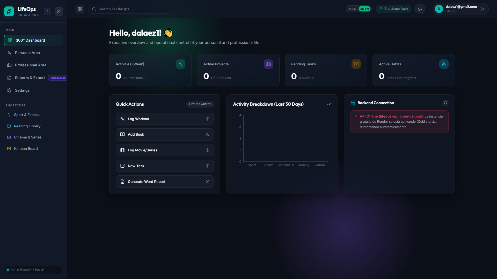
┌────────────────────────────────────────────────────────────────────────┐
│  👋 Welcome back, Diego!                                               │
│  Daily overview of personal telemetry and professional project flow.   │
├─────────────────┬─────────────────┬─────────────────┬──────────────────┤
│ 🏃 ACTIVITIES   │ 💼 PROJECTS     │ 📋 TASKS        │ 🔥 HABITS        │
│      28         │        5        │      14         │     6 / 7        │
│ 142 total       │ Of 8 active     │ 2 overdue       │ Active streaks   │
├─────────────────┴─────────────────┴─────────────────┴──────────────────┤
│  ⚡ QUICK ACTIONS: [+ Log Workout] [+ New Book] [+ Task] [+ Report]     │
├──────────────────────────────────────┬─────────────────────────────────┤
│  📊 ACTIVITY BREAKDOWN (30 DAYS)     │  📡 BACKEND HEALTH MONITOR      │
│  [Recharts Bar Chart with Neon Bars] │  🟢 FastAPI Online (Render.com) │
│  ■ Fitness  ■ Books  ■ Cinema        │  🗄️ Supabase DB (lifeops schema)│
└──────────────────────────────────────┴─────────────────────────────────┘
To keep navigation intuitive without cluttering the screen, we organized the sidebar into two functional tiers: primary top-level areas (Dashboard, Personal Area, Professional Area, Reports, Settings) and quick thematic shortcuts linking directly to everyday logging flows (Fitness, Books, Cinema, Kanban Board):
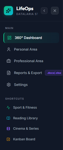
The top metrics grid features semantic accent variants designed for quick cognitive parsing:
export function StatWidget({ title, value, subtitle, icon: Icon, color = 'emerald' }) {
  return (
    <div className={`stat-widget glass-card color-${color}`}>
      <div className="stat-widget-header">
        <span className="stat-title">{title}</span>
        {Icon && (
          <div className="stat-icon-wrapper">
            <Icon size="{20}"/>
          </div>
        )}
      </div>
      <div className="stat-widget-body">
        <span className="stat-value">{value ?? 0}</span>
        {subtitle && <span className="stat-subtitle">{subtitle}</span>}
      </div>
    </div>
  );
}
Each color variant (color-emerald, color-cyan, color-purple, color-amber) washes the icon container in a 20% opacity translucent glow (--accent-emerald-glow), establishing instant visual categorization without visual noise.
4.3. Activity Telemetry with Recharts
To visualize monthly activity volume, we fetch data from /api/v1/stats/breakdown and render a responsive bar chart:
import { BarChart, Bar, XAxis, YAxis, Tooltip, ResponsiveContainer, Cell } from 'recharts';

const chartData = [
  { name: 'Sport', count: breakdown?.sport || 0, color: '#10b981' },
  { name: 'Books', count: breakdown?.book || 0, color: '#06b6d4' },
  { name: 'Cinema/TV', count: breakdown?.film || 0, color: '#8b5cf6' },
  { name: 'Learning', count: breakdown?.learning || 0, color: '#f59e0b' },
  { name: 'Journal', count: breakdown?.journal || 0, color: '#ec4899' },
];

<div style={{ width: '100%', height: 220 }}>
  <ResponsiveContainer height="100%" width="100%">
    <BarChart -20, 0 10, bottom: data="{chartData}" left: margin="{{" right: top: }}>
      <XAxis dataKey="name" fontSize="{12}" stroke="#6b7280" tickLine="{false}"/>
      <YAxis allowDecimals="{false}" fontSize="{12}" stroke="#6b7280" tickLine="{false}"/>
      <Tooltip '#fff', '8px', 'rgba(17, 'rgba(255, 0.1)', 0.95)', 24, 255, 39, backgroundColor: borderColor: borderRadius: color: contentStyle="{{" }}/>
      <Bar 0, 0]} 6, dataKey="count" radius="{[6,">
        {chartData.map((entry, index) => (
          <Cell fill="{entry.color}" key="{`cell-${index}`}"/>
        ))}
      </Bar>
    </BarChart>
  </ResponsiveContainer>
</div>
Friction is the number one reason personal productivity dashboards fall out of use. Logging a workout or finishing a book chapter must never require navigating through multiple nested views. From the central hub, the QuickActions panel exposes direct action buttons that launch focused data entry modals instantly:
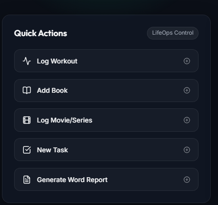
5. Production Resilience: Handling Render Cold-Starts (SystemHealth) 🛡️
As noted in Part 1, our backend runs on the free tier of Render.com, which automatically puts containers to sleep after 15 minutes of inactivity.
When an end-user visits LifeOps after several hours of downtime, the initial HTTP handshake takes 20 to 40 seconds while the container spins up. Without proactive frontend handling, users would encounter frozen loaders or abrupt network errors.
To solve this, I designed the SystemHealth.jsx component:
export function SystemHealth() {
  const [health, setHealth] = useState(null);
  const [loading, setLoading] = useState(true);
  const [error, setError] = useState(null);
  const [retryCount, setRetryCount] = useState(0);

  const checkHealth = async (isAutoRetry = false) => {
    setLoading(true);
    if (!isAutoRetry) setError(null);

    try {
      const data = await api.getHealth();
      setHealth(data);
      setError(null);
    } catch (err) {
      setError(err.message || 'API Connection Error');

      // Auto-retry up to 3 times with 6-second backoff while Render wakes up
      if (retryCount < 3) {
        setTimeout(() => setRetryCount((prev) => prev + 1), 6000);
      }
    } finally {
      setLoading(false);
    }
  };

  useEffect(() => {
    checkHealth(retryCount > 0);
  }, [retryCount]);

  return (
    <div className="system-health-widget glass-panel">
      {error ? (
        <div className="health-alert error">
          <AlertCircle size="{18}"/>
          <span>Render instance waking up (Cold start)... retrying automatically.</span>
        </div>
      ) : (
        <div className="health-alert success">
          <CheckCircle2 size="{18}"/>
          <span>{health?.engine} — Online (Schema: {health?.schema})</span>
        </div>
      )}
    </div>
  );
}
[!NOTE]
This automatic retry strategy converts what would otherwise look like an outage into an informative, real-time telemetry indicator.
6. Featherweight Native Internationalization (i18n) 🌐

Many single-page apps install heavy internationalization suites that bundle unnecessary complexity. For LifeOps, I built an elegant, zero-dependency translation engine in under 80 lines within LanguageContext.jsx:
import React, { createContext, useContext, useState, useEffect } from 'react';
import { es } from '../i18n/locales/es';
import { en } from '../i18n/locales/en';

const translations = { es, en };
const LanguageContext = createContext();

export function LanguageProvider({ children }) {
  const [language, setLanguageState] = useState(() => {
    const saved = localStorage.getItem('lifeops_language');
    if (saved === 'es' || saved === 'en') return saved;
    return navigator.language?.toLowerCase().startsWith('es') ? 'es' : 'en';
  });

  const toggleLanguage = () => {
    const next = language === 'es' ? 'en' : 'es';
    setLanguageState(next);
    localStorage.setItem('lifeops_language', next);
    document.documentElement.lang = next;
  };

  // Dot-notation resolver with dynamic token interpolation
  const t = (path, params = {}) => {
    const dict = translations[language] || translations.es;
    let val = path.split('.').reduce((prev, curr) => prev?.[curr], dict) || path;
    if (typeof val === 'string') {
      return Object.keys(params).reduce((str, key) => str.replace(new RegExp(`\\{${key}\\}`, 'g'), params[key]), val);
    }
    return val;
  };

  return (
    <LanguageContext.Provider language, t toggleLanguage, value="{{" }}>
      {children}
    </LanguageContext.Provider>
  );
}

export const useLanguage = () => useContext(LanguageContext);
Key Architectural Benefits:
- Zero External Dependencies: Shaves over 100 KB from production bundle footprints.
- Intuitive API: Translates seamlessly via
t('dashboard.welcome') or interpolates counts with t('sport.stats.distance', { count: 10 }).
- Smart Persistence & Auto-Detection: Stores preference in
localStorage and detects the browser's preferred locale on first visit.
Conclusion & What's Next 🎯
With our React frontend fully configured, the Glassmorphism Dark Mode design system operational, reactive authentication connected to Supabase, and the 360° Dashboard displaying real-time metrics, LifeOps now has an engaging, modern client ready for daily use.
In Part 3 of this series, we dive directly into the functional core:
- Fitness & Sport Module: Logging runs, gym workouts, and cycling sessions with pace calculations, Personal Bests (PB), and calorie tracking.
- Reading & Cinema Tracking: Dynamic page completion bars, streaming platform catalogs, and ratings.
- Professional Kanban Board: 4-column project workflow, task prioritization, and chronological progress logging with timestamps stored in PostgreSQL JSONB.
References & Useful Links 🔗
See you in Part 3! Feel free to share your thoughts or frontend architectural tips in the comments below. 👇