Web Theme Loader with Comprehensive Features and Minimum API Surface
You can use this simple, powerful and flexible Web theme loader in your Web app especially SPA+PWA to realize similar UX as seen in these prominent sites:
- Angular Material Doc
- PrimeNG
- PrimeVue
- DaisyUI
Web Sites and Apps that Use This ThemeLoader
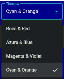
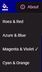
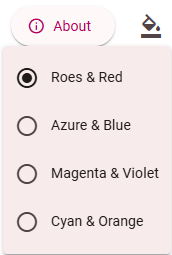
Summary
The Web theme loader API exposes 3 contracts:
static init() of themeLoader to be called during app startup.static loadTheme(picked: string | null, appColorsDir?: string | null) to be called when the app user picks one from available themes.static get selectedTheme(): string | null of themeLoader to give the URL of the selected theme, so GUI may display which theme is in-use.
Because the theme should be loaded at startup before the Web app rendering, the respective config must be loaded synchronously ASAP.
The GUI of theme selection is independent of the Web theme loader API. For example, in addition to Select and Menu for multiple themes, you may use Switch for switching between light and dark.
Remarks:
- Modern browsers like Chrome, Edge, Safari, and Firefox support a built-in concept of light/dark preference. Depending on your UX design, if you would want your Website or Webapp to adapt such preference automatically and do not expect users to change theme, then CSS only solution works well without using JavaScript code:
<link rel="stylesheet" href="my-light.css" media="(prefers-color-scheme: light)">
<link rel="stylesheet" href="my-dark.css" media="(prefers-color-scheme: dark)">
Installation
- Install theme-loader-api:
npm install theme-loader-api
Integration
- Call
ThemeLoader.loadTheme() before the bootstrap of the Web app.
- In the UI component presenting the theme picker, convert the themes dictionary to an array which will be used to present the list. And call
ThemeLoader.loadTheme() when the picker picks a theme.
- Prepare
siteconfig.js and add <script src="conf/siteconfig.js"></script> to index.html if you want flexibility after build and deployment. Or, simply provide constant THEME_CONFIG in app code.
main.ts
ThemeLoader.init();
bootstrapApplication(AppComponent, appConfig);
theme-select.component.ts
constructor() {
this.themes = ThemeConfigConstants.themesDic ? Object.keys(ThemeConfigConstants.themesDic).map(k => {
const c = ThemeConfigConstants.themesDic![k];
const obj: ThemeDef = {
display: c.display,
filePath: k,
dark: c.dark
};
return obj;
}) : undefined;
}

themeSelectionChang(e: MatSelectChange) {
ThemeLoader.loadTheme(e.value);
}
theme-select.component.html
<mat-select #themeSelect (selectionChange)="themeSelectionChang($event)" [value]="currentTheme">
@for (item of themes; track $index) {
<mat-option [value]="item.filePath">{{item.display}}</mat-option>
}
</mat-select>
siteconfig.js
const THEME_CONFIG = {
themesDic: {
"assets/themes/azure-blue.css": { display: "Azure & Blue", dark: false },
"assets/themes/rose-red.css": { display: "Roes & Red", dark: false },
"assets/themes/magenta-violet.css": { display: "Magenta & Violet", dark: true },
"assets/themes/cyan-orange.css": { display: "Cyan & Orange", dark: true }
},
themeLoaderSettings: {
storageKey: 'app.theme',
themeLinkId: 'theme',
appColorsDir: 'conf/',
appColorsLinkId: 'app-colors',
colorsCss: 'colors.css',
colorsDarkCss: 'colors-dark.css'
}
}
index.html
    <script src="conf/siteconfig.js"></script>
</head>
React Example
main.tsx
ThemeLoader.init();

const root = ReactDOM.createRoot(
  document.getElementById('root') as HTMLElement
);
root.render(...
Home.tsx
const themes = ThemeConfigConstants.themesDic ? Object.keys(ThemeConfigConstants.themesDic).map(k => {
const c = ThemeConfigConstants.themesDic![k];
const obj: ThemeDef = {
display: c.display,
filePath: k,
dark: c.dark
};
return obj;
}) : undefined;

const [currentTheme, setCurrentTheme] = useState(() => ThemeLoader.selectedTheme ?? undefined);
const handleChange = (event: React.ChangeEvent<HTMLSelectElement>) => {
const v = event.target.value;
setCurrentTheme(v);
ThemeLoader.loadTheme(v);
};

return (
<>
<h1>React Heroes!</h1>
<div>
<label htmlFor="theme-select">Themes </label>
<select
id="theme-select"
value={currentTheme ?? ""}
onChange={handleChange}
>
{themes?.map((item) => (
<option key={item.filePath} value={item.filePath}>
{item.display}
</option>
))}
</select>
</div>
siteconfig.js
const THEME_CONFIG = {
themesDic: {
"assets/themes/light-theme.css": { display: "Light", dark: false },
"assets/themes/dark-theme.css": { display: "Dark", dark: true },
"assets/themes/pink-theme.css": { display: "Pink", dark: false }
},
themeLoaderSettings: {
storageKey: 'app.theme',
themeLinkId: 'theme',
appColorsDir: 'conf/',
appColorsLinkId: 'app-colors',
colorsCss: 'colors.css',
colorsDarkCss: 'colors-dark.css'
}
}
index.html
    <script src="conf/siteconfig.js"></script>
</head>
Respect prefers-color-scheme
By default, this API will pick the first available theme in the dictionary during the first startup of the Web app, and use last pick afterward. If you want to respect prefers-color-scheme during the initial load of the Web app, you may use the following in the app's bootstrap:
const isDark = window.matchMedia('(prefers-color-scheme: dark)').matches;
var r = findFirstTheme(isDark);
if (r) {
ThemeLoader.loadTheme(r.filePath);
}

platformBrowser().bootstrapModule(AppModule, { applicationProviders: [provideZoneChangeDetection()], })
.catch(err => console.error(err));

function findFirstTheme(dark: boolean): { filePath: string; theme: ThemeValue } | undefined {
const entry = Object.entries(ThemeConfigConstants.themesDic!).find(
([, theme]) => theme.dark === dark
);

return entry ? { filePath: entry[0], theme: entry[1] } : undefined;
}
How About I18N and L10N?
The only things need to be translated is the display name of each theme.
Solution 1: No need for I18N and Use Icon To Represent Theme Impression
You may extend interface ThemeDef, and make it contain some meta info of generating SVG icons presenting respective theme. And the icons will be inline with the HTML template. Angular Material Components site uses this approach.
Or you may just hand-draw some SVG icons and linked them in the HTML template.
Solution 2: Create Dictionary in App Code
Depending the framework like Angular or the library like React, there could be a few ways to create a dictionary to lookup translations and create translations.
Solution 3: Post Build Processing
If you are using siteconfig.js, the JS file should not be included in the hash tables of the service worker for automatic app update.
In Angular, each locale has its own build, therefore, you may craft some post build script to inject the translated names into the siteconfig.js of each build.