Circular progress, pie charts, and step rings usually mean SVG path math or a chart library.
circle-progress.fscss does it with pure CSS — conic-gradient, masks, and FSCSS @define helpers.
Repo: Figsh/Circle-progress.fscss
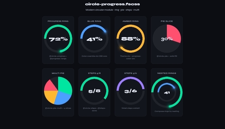
What you get
| Component | Define |
|---|
| Progress ring | @circle-progress |
| Solid pie | @circle-pie |
| Multi-slice pie | @circle-pie-multi |
| Steps ring | @circle-steps |
| Nested rings | Compose by nesting elements |
All driven by CSS variables. Change --progress-value and the arc follows.
Setup
Option A — runtime (quick / prototyping)
<script src="https://cdn.jsdelivr.net/npm/fscss@1.2.1/runtime.min.js" defer></script>
Option B — CLI compile (production)
It works well with FSCSS vscode extention
npm install -g fscss
fscss styles.fscss styles.css
Import the module:
@import((*) from circle-progress)

@progress-root()
@circle-progress(.progress-circle)
Full sample page:
samples/example.html
1. Progress ring
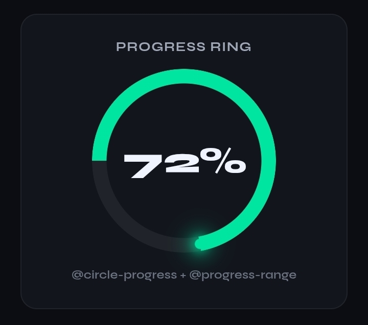
<div class="progress-circle p72">72%</div>
.p72 { @progress-range(72) }
Under the hood: a conic-gradient draws the arc, a radial mask cuts the hole, and a small tip marker rotates with the value.
2. Color override
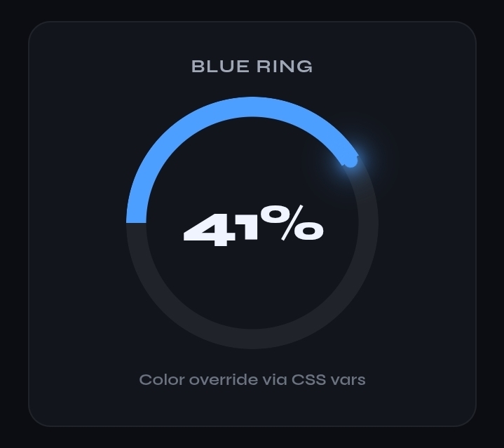
.p41 {
  @progress-range(41)
  --progress-color-arc: #4d9fff;
  --progress-color-glow: rgba(77, 159, 255, 0.45);
}
Same component — only tokens change.
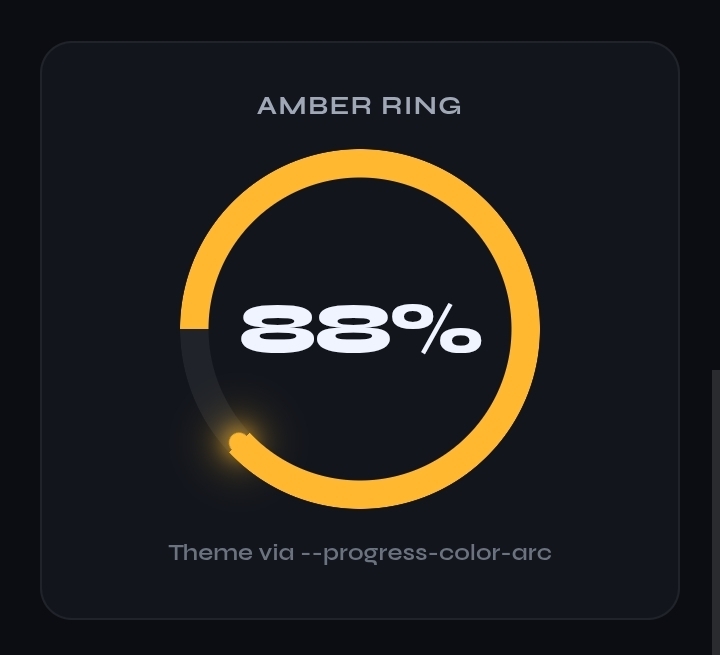
.p88 {
  @progress-range(88)
  --progress-color-arc: #ffb830;
  --progress-color-glow: rgba(255, 184, 48, 0.4);
}
3. Pie slice
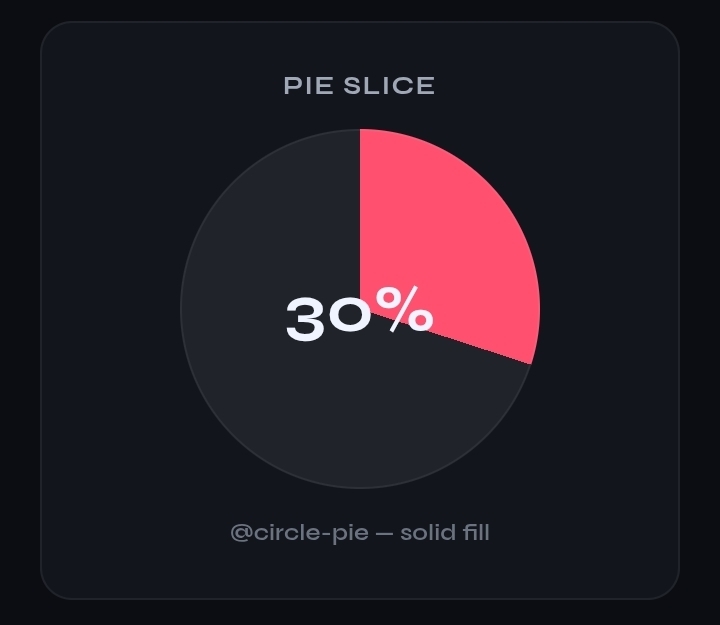
<div class="circle-pie p30">30%</div>
@circle-pie(.circle-pie)
.p30 { @progress-range(30) --progress-color-arc: #ff5070; }
No mask — the conic fill is the whole disk.
4. Multi pie
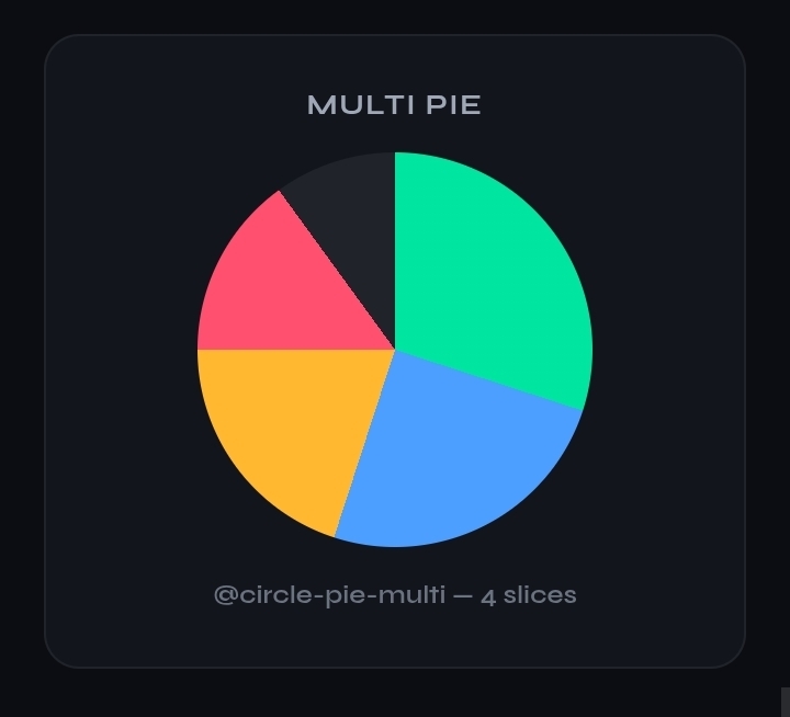
<div class="circle-pie-multi pie-a"></div>
@circle-pie-multi(.circle-pie-multi)

.pie-a {
  --pie-a: 30;
  --pie-b: 25;
  --pie-c: 20;
  --pie-d: 15;
}
Four slices from four percentage tokens.
5. Steps ring
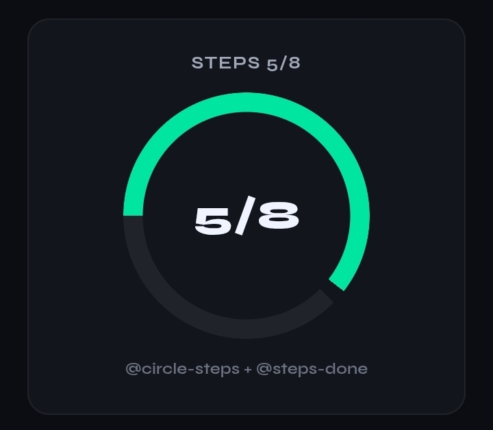
<div class="circle-steps steps-5">5/8</div>
@circle-steps(.circle-steps)
.steps-5 { @steps-done(5) @steps-total(8) }
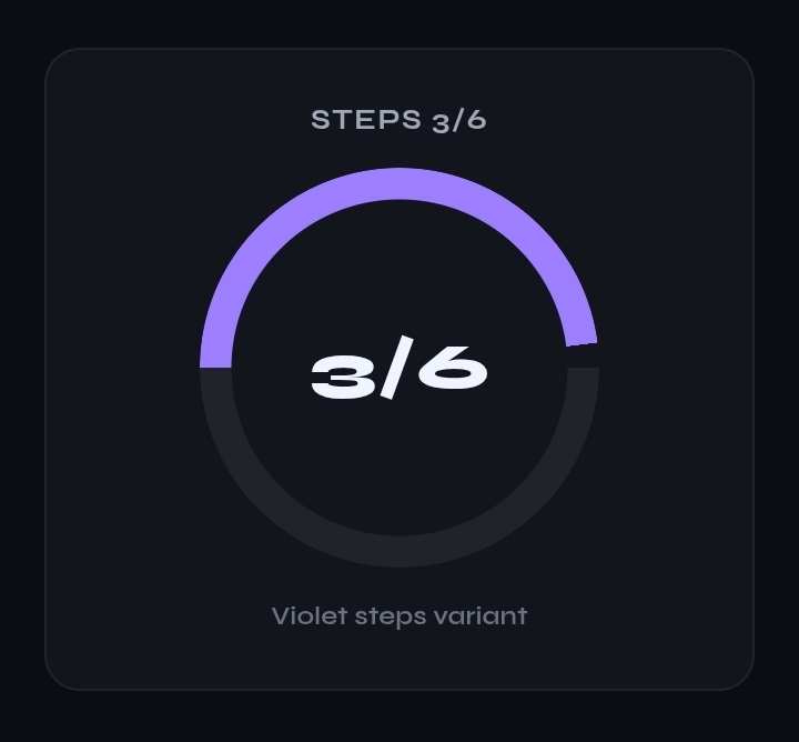
.steps-3 {
  @steps-done(3)
  @steps-total(6)
  --progress-color-arc: #9d7eff;
}
6. Nested rings

<div class="progress-circle p72" style="--progress-size:200px">
  <div class="progress-circle p41"
       style="--progress-size:120px;--progress-stroke:10px">
    41
  </div>
</div>
Same define, different size/stroke on the child — composition without new APIs.
Mental model
- Tokens —
@progress-root() sets size, stroke, colors, value.
- Shape — one
@define per pattern (ring, pie, steps).
- Value —
@progress-range(n) or --progress-value.
- Theme — override
--progress-color-arc / --progress-color-glow.
No SVG paths. No chart library. Change a variable, the circle updates.
When to use runtime vs CLI
| Use case | Prefer |
|---|
| Demos, CodePen, quick tests | CDN runtime |
| Production, static deploy | CLI compile to plain CSS |
Runtime keeps FSCSS syntax in the page. CLI ships zero-runtime CSS.
Try it
Clone or copy from the repo and open the sample:
github.com/Figsh/Circle-progress.fscss
Sample: samples/example.html
Swap values, nest rings, add a pie — same module, different tokens.
Built with FSCSS @define · pure CSS circular UI