Every README I've ever maintained has had that one section near the top: badges for stars, forks may be build status icon. They work, but they're just... images. Static, generic, the same little badge everyone else's repo has too.
What I actually wanted was simpler to describe than it turned out to be to build: pull the real numbers from a repo, turn them into an actual chart, commit it as an SVG, embed it like any other image. No third-party badge service holding my stats hostage, no client-side JS running in a README that can't run JS anyway.
So I built ProvChart Repo Stats.
What it actually writes
It's a GitHub Action. Point it at a repo, give it an API key, and on schedule (or on demand) it writes two SVGs straight into your repo:
| File | Content | Default chart |
|---|
docs/charts/repo-overview.svg | Stars, forks, watchers, open issues | area |
docs/charts/languages.svg | Language share | horizontal bar |
That's it. No hand-maintained JSON describing what the chart should look like, no dashboard to babysit. The numbers come from GitHub's API, the chart comes from ProvChart, the action wires the two together and commits the result.
Setup
1. Add a repo secret. Grab an API key from the ProvChart dashboard and save it as PROVCHART_API_KEY under your repo's Settings → Secrets → Actions.
2. Drop in the workflow.
name: Repo stats charts

on:
  schedule:
    - cron: "0 8 * * 0"
  workflow_dispatch:

permissions:
  contents: write

jobs:
  charts:
    runs-on: ubuntu-latest
    steps:
      - uses: actions/checkout@v4

      - uses: fscss-ttr/provchart-repo-stats@v1.3
        with:
          api-key: ${{ secrets.PROVCHART_API_KEY }}
        env:
          PROVCHART_API_KEY: ${{ secrets.PROVCHART_API_KEY }}

      - uses: stefanzweifel/git-auto-commit-action@v5
        with:
          commit_message: "chore: update repo stats charts"
          file_pattern: "docs/charts/*.svg"
3. Embed the SVGs in your README like any other image.


Run the workflow once manually, or just wait for the Sunday morning cron. The action commits the SVGs, your README stays plain Markdown, nothing else changes about how your repo works.
What the charts actually look like
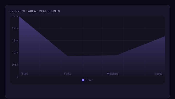
The overview chart is an area chart plotting your real counts, not squeezed onto a 0-to-100 scale:
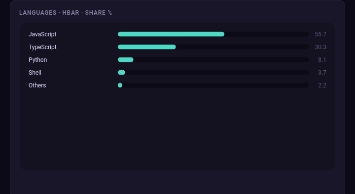
And the language breakdown renders as a clean horizontal bar, share by percentage:
A couple of defaults worth knowing
- Overview uses real counts. If your repo has 3,200 stars, the chart says 3,200, it's not forced into a 0-100 box.
- Languages render as share percentages, which is usually the more useful way to look at a language breakdown anyway.
- Both are configurable if the defaults don't fit:
overview-type and languages-type let you switch to bars if that's more your style.
Under the hood it's all generated through ProvChart's generate-svg endpoint, so there's no image hosting involved and nothing rendered client-side. The SVG is just... a file in your repo, same as any other asset.
If you already maintain a .provchart/charts.json and want fixed sample charts instead of live repo metrics, there's a sibling action for that: provchart-readme-action.
Try it
Repo, issues, and feedback: github.com/fscss-ttr/provchart-repo-stats
If you end up using it on something, I'd genuinely like to see what your README looks like with it. And if something breaks or a default doesn't make sense for your use case, open an issue, I'm actively maintaining.